the problems
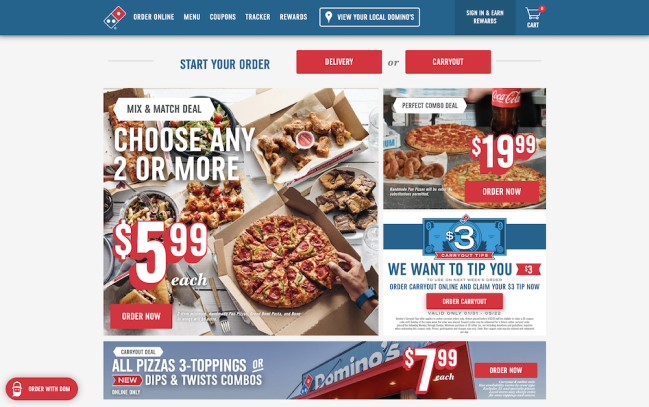
The existing layout of Domino's website poses accessibility issues. It appears disorganized, lacks a clear visual structure, and incorporates extremely small fonts that are difficult to read for the majority of users. The uncomplicated ordering process is convoluted, requiring multiple steps, which results in user frustration.
our solution
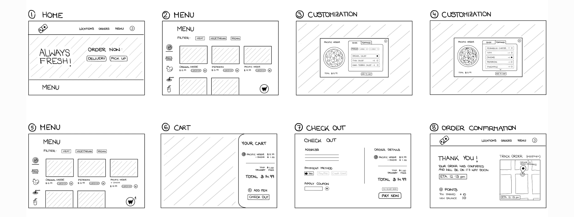
Upon thorough examination of both the visual interface and information architecture of the existing Domino's website, we have developed a revised design that enhances accessibility. Our primary objective was to streamline site navigation, making it more user-friendly and intuitive. This refinement is particularly evident in the ordering procedure, where we successfully condensed the process from over 15 individual steps to just 8, spanning from the website's entry point to finalizing the order placement.
Below is the demonstration of our final prototype.
- Reorganized landing page makes the experience more intuitive
- Clear categories and preference filter help user find products more efficiently
- Provide clear and direct preview when customizing products
- Clear categories and preference filter help user find products more efficiently
- Redesigned cart and check-out page provides more organized information
- Product detail incorporates calories calculator from the original website and makes it more accessible
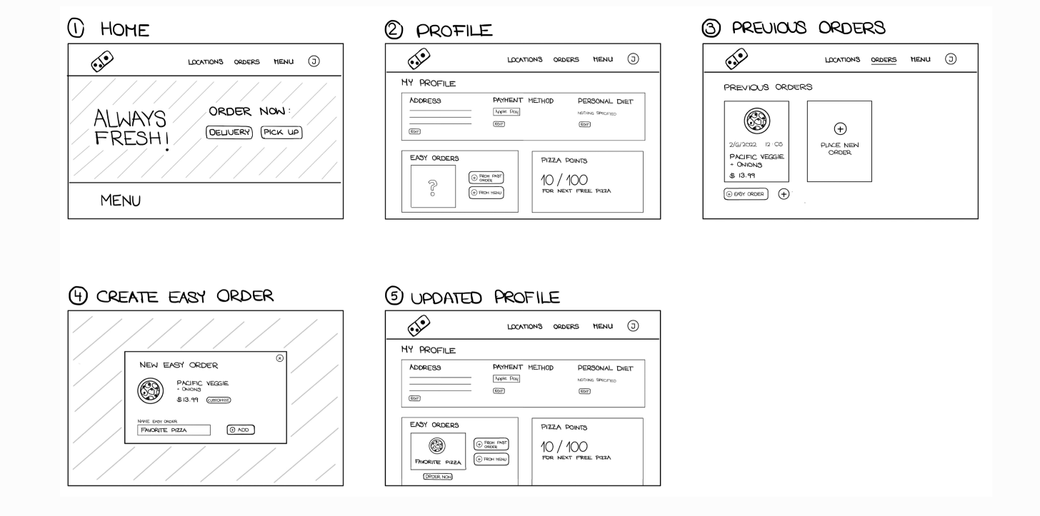
- Users no more have to create an Easy Order before using it, they can also start from their previous orders and saved items
researching stage
domain research
According to McKinsey & Company's report, the market size of food delivery has doubled during the COVID-19 pandemic and is predicted to remain an essential factor for the dining sector. As a result, it has become an essential factor for the dining sector to provide efficient and reliable delivery services.
Domino's, as one of the earliest companies that offer food delivery service, was also benefited from the environment. However, with the rapidly evolving technology and changing consumer behavior, it is crucial for Domino's to upgrade their website to remain competitive and meet the increasing customer demands. By enhancing their website's user experience, Domino's can improve customer satisfaction and loyalty while also increasing their market share in the food delivery industry.
competitor analysis
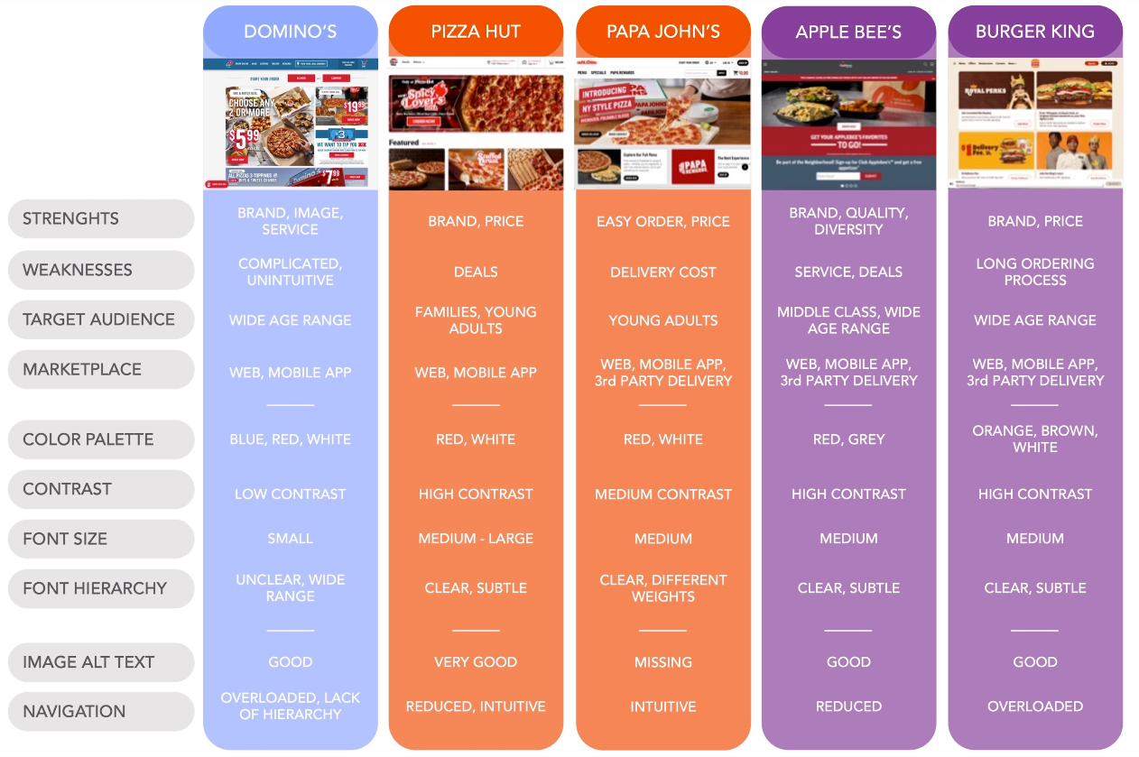
For the next step, our team conducted a competitor analysis, comparing the websites of both direct competitors (Pizza Hut, Papa John’s) and indirect competitors (Applebee’s, Burger King) with Domino’s desktop experience.
interview synthesis

persona
user stories
prototyping stage
product requirement

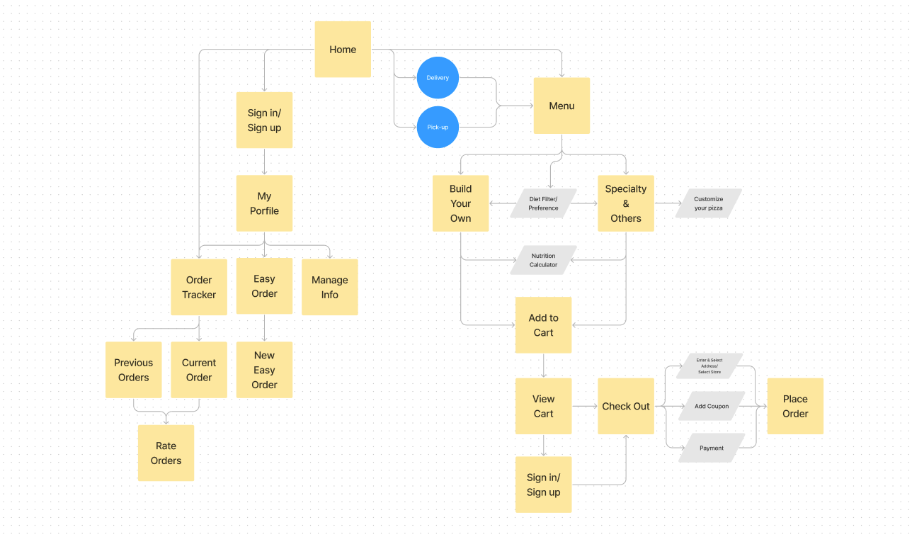
application map
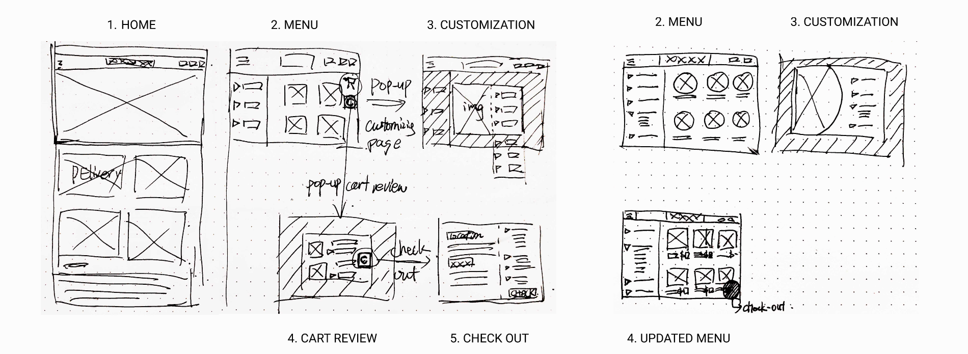
initial sketches
user flow
flow 1: place an order
flow 2: create an easy order
usability test
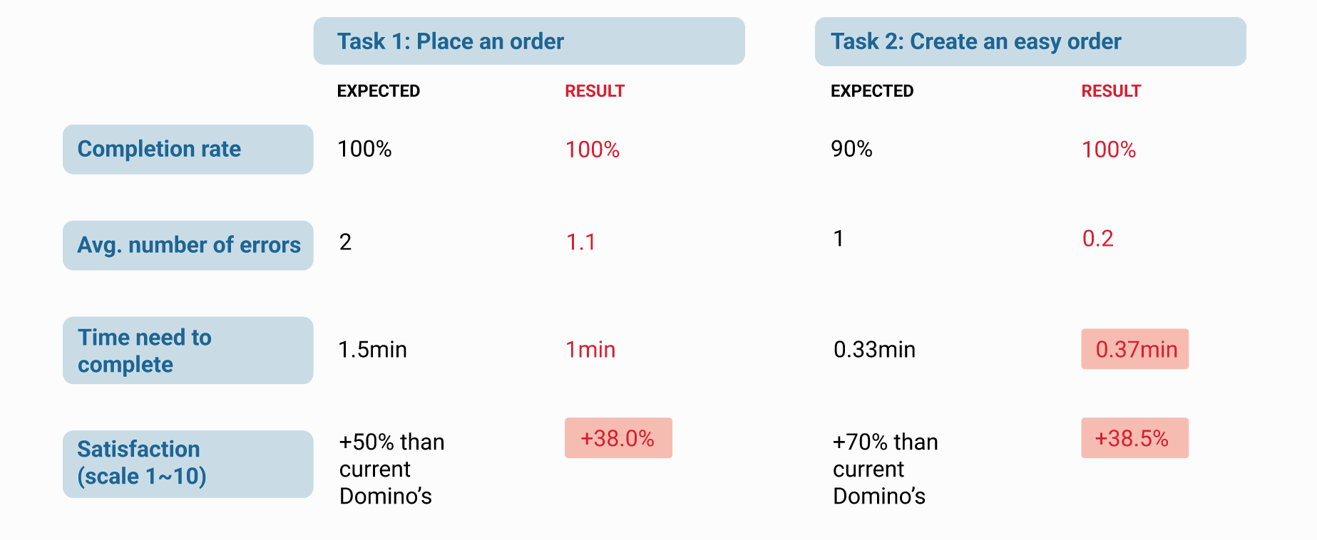
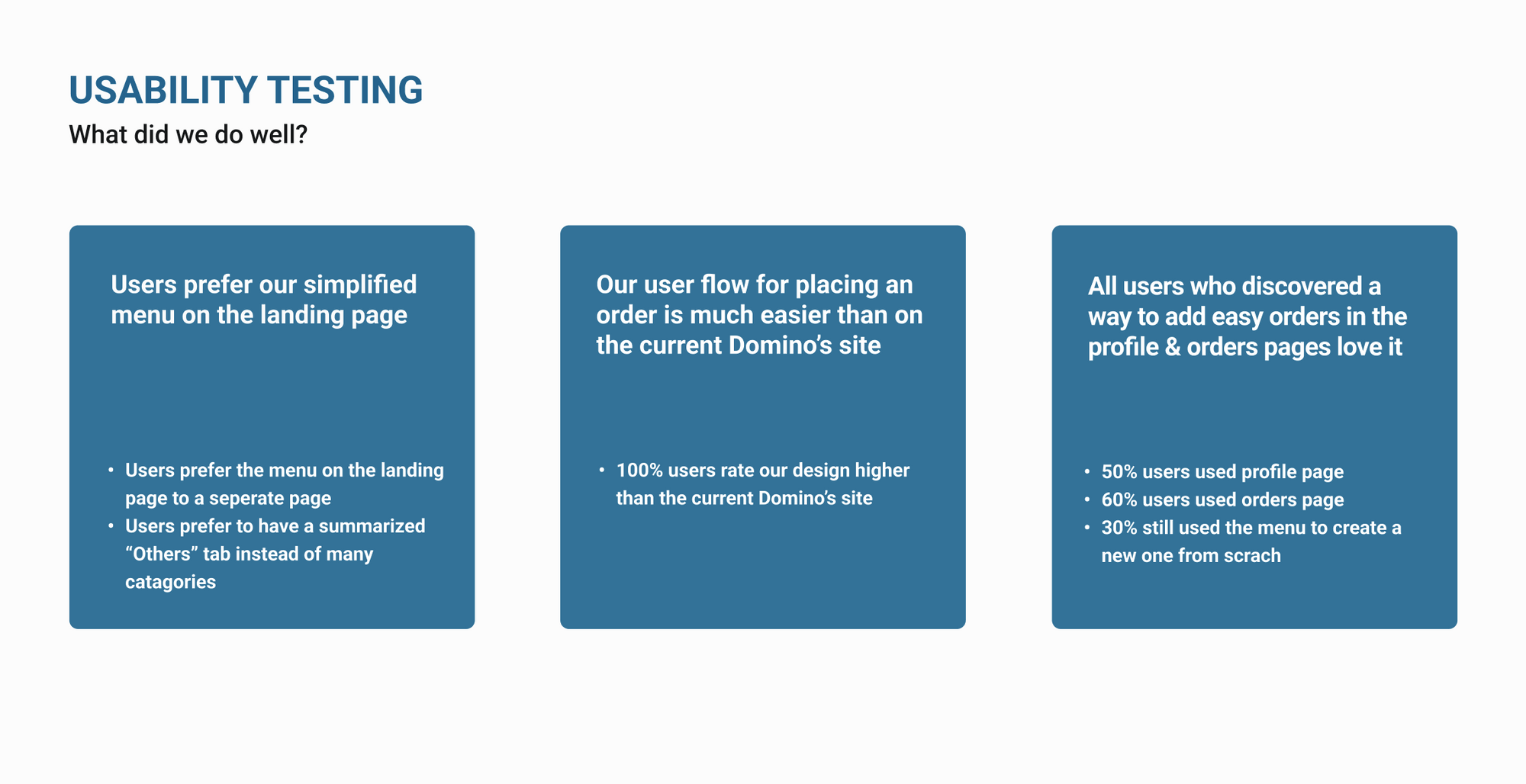
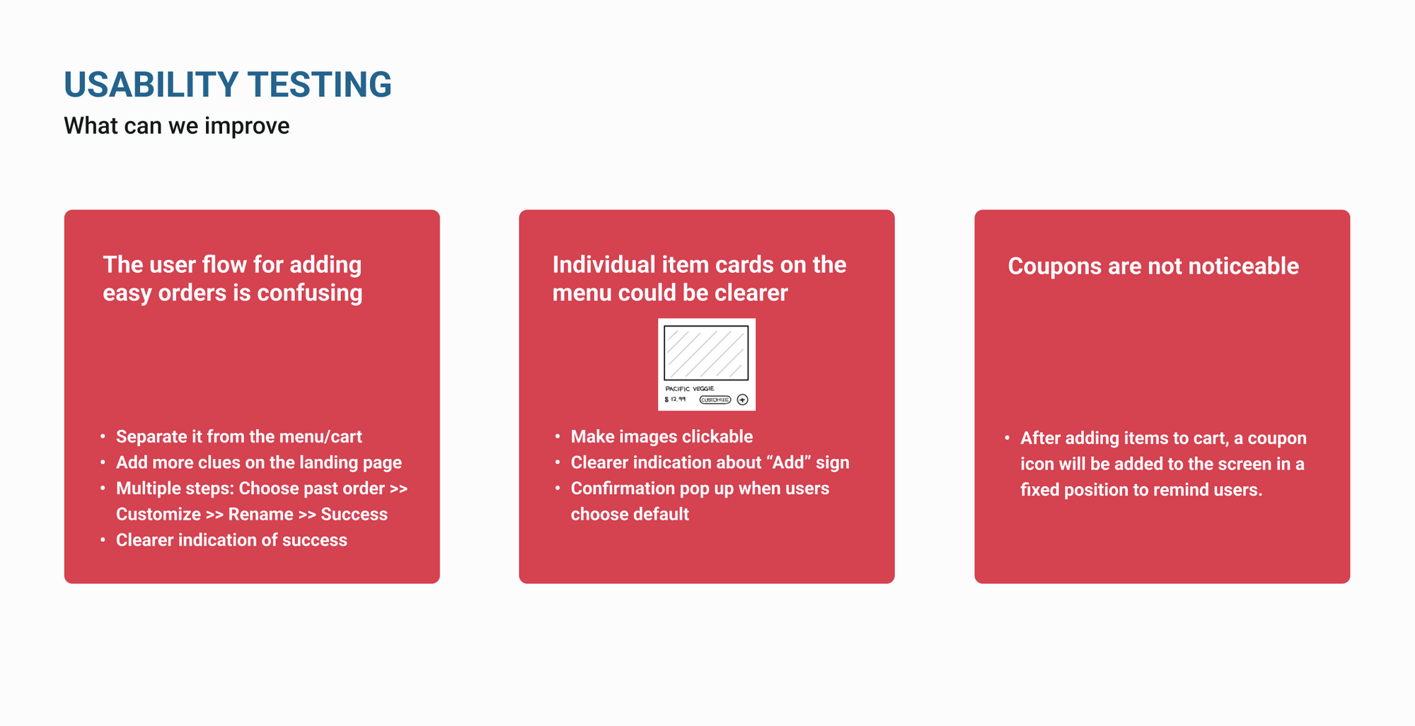
Copyright © 2023 Jiacheng Jiang. All rights reserved.
